3D DESIGN & VISUALIZATION


Sandeep Basak

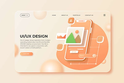
UI DESIGN
For Web Page & Mobile App

Welcome to our UI design showcase, where we blend creativity with functionality to create visually stunning and user friendly interfaces. Our design philosophy is rooted in a deep understanding of color theory and user experience, ensuring that every element serves a purpose while enhancing the overall aesthetic.
Explore our website to see how we blend aesthetics with usability, creating designs that are not only beautiful but also enhance the overall user experience. Join us on this journey of innovation and creativity in UI design!
Color Palette :
We employ a carefully curated color scheme that embodies the principles of the 60-30-10 rule, which promotes balance and
visual appeal. Utilizing powerful design tools like Inkscape and Lunacy, we bring our vision to life with precision and creativity. Inkscape allows us to create scalable vector graphics, ensuring that our designs are crisp and adaptable across various screen sizes. Lunacy enhances our workflow with its collaborative features, enabling us to iterate quickly and efficiently.
Design Inspiration :
Welcome to our UI design showcase, where we blend creativity with functionality to create visually stunning and user friendly interfaces. Our design philosophy is rooted in a deep understanding of color theory and user experience, ensuring
that every element serves a purpose while enhancing the overall aesthetic.

Color Rule & Theory :

60% Dominant Color: Our primary color serves as the foundation of the design, creating a cohesive and inviting atmosphere. This color is reminiscent of the soft, muted tones found in contemporary UI designs, providing a calming backdrop for content.
30% Secondary Color: The secondary color complements the dominant hue, adding depth and contrast. This color is strategically used in key areas, such as buttons and highlights,
to draw attention and guide users through the interface.
10% Accent Color: Our accent color is used sparingly to create focal points and enhance visual interest. This vibrant hue adds a touch of energy and excitement, making important elements stand out without overwhelming the user.


